
When you visit a website, you generally make a judgement about its trustworthiness and reliability within a minute. Footer signaling is a big part of that.
Most websites have footers, they're the copy/pasted section at the bottom of almost every webpage. Usually they include a privacy policy, terms of service, and occasionally social media links.
While updating webapp.io's footer yesterday, I realized that the size and comprehensiveness of a company's footer is a relatively good proxy for its revenue and legitimacy.
I'm calling this idea "footer signalling." Very few visitors actually click any of the fifty links in a modern footer, but they are required to be there so that the company can flaunt the fact that its content exists.
Example one, BareMetrics
For a concrete example, take a look at BareMetrics - they're a revenue visualization company. I've chosen them as an example because they make their own revenue public, and they've been around for almost 10 years, so we can see how their footer evolved over time:
1 month after founding: $1,600/mo revenue
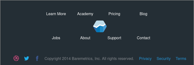
The footer has three social media icons, three policies, and eight navigation links. You can tell that at least a month of work has gone into the company at this point, just to get the relevant accounts and pages set up.
6 months after founding: $6,000/mo revenue
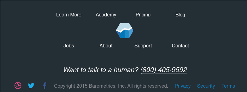
The footer is styled very similarly, but they've added a toll-free phone number. At this point the BareMetrics team is likely starting to talk to bigger accounts that don't want to trust their financial data to a stranger.
12 months after founding: $25650/mo revenue

A redesign! In addition to the existing elements, they've added a few more links (wall of love, support, log in) and a call to action (start my free trial), alongside an intercom-style chat widget. The social media links are gone for now.
24 months after founding: $40,000/mo revenue

Not much change from 12 months, a few more links (academy, customer stories, developers)
Now: $170,000/mo revenue
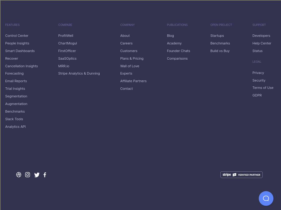
A big change in five years, now there are nearly 50 links, and the social media links are back. Additionally, the call to action has been removed, and replaced with a badge (stripe verified partner)
Example two, hubstaff.com
Similarly to BareMetrics, HubStaff also makes their revenue public:
1 month after founding: $1,000/mo revenue

This footer predates the SaaS boom, it feels very reminiscent of windows vista, and only has four links and two calls to action (download for mac/windows)
6 months after founding: $4,000/mo revenue

Things are already looking up, they've gotten rid of the Window Vista styling and added credibility information like an "All rights reserved" and company address. 9 internal links and 4 social media links.
12 months after founding: $5,000/mo revenue

Very much the same, though additional direct links to the windows, mac, and linux clients have been added. 13 internal links and 5 external links.
24 months after founding: $28,000/mo revenue
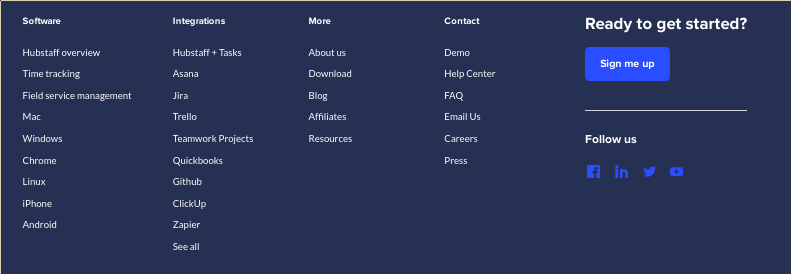
A redesign! And they've added more internal links, there are now 30 internal links on top of the four external ones.
Today: $1,100,000/mo revenue
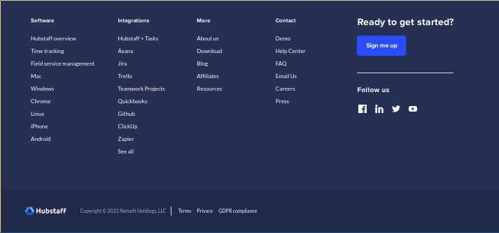
Not much has changed in four years, they've added a new logo at the bottom and now mention GDPR compliance and standard terms.
Conclusion: Footer links are proportional to revenue
It might not be surprising on hindsight, but many of a company's visitors will be looking at your company's footer to gauge how mature it is. Padding the links with a few relevant pages will go a long way to making it look like you have eight figures of revenue.